Whether it’s bleed, CMYK vs RGB, or cover and text weight there is no shortage of jargon in the printing industry. We can help you increase the quality of your print marketing by learning the ins and outs of printing and following these helpful tips.
What is bleed? And why does it matter?
If you have spent enough time ordering print you have probably encountered the term “bleed”. Bleed refers to a design element that allows colors or images to flow all the way to the edge of a printed piece. Bleed is achieved by building extra space into your print design that will be trimmed off in final production. This extra space ensures your final design is trimmed with precision. Here are two examples of a print file prepped for production.

The above file contains .125” of extra space around all 4 edges of the final business card design. Designing with bleed means each finished card will be precisely trimmed with no white edges and without the artwork from an adjacent card potentially overlapping with the final piece.

This above file does not contain bleed. Although trimming out a print item is a precision process, slight variances can occur. With no margin for error, the possibility for a miscut exists in this file that may result in unsightly edges and misalignment in the final trimmed card.
Admail has design templates available upon request for any print item we can produce.
CMYK vs RGB
There are two types of color space used in graphic design. One for web and another for print. The two overlap but have distinctly different purposes.
CMYK – Almost every item you see printed today is created with only 4 colors: cyan, magenta, yellow, and black, or CMYK. This four-color process makes it possible to produce a nearly infinite number of colors. It is the one and only standard for commercially produced full-color print. Because your print or mail design will serve a purpose beyond a screen, it is always best to design in the same color space your printer will use to produce your project.
RGB – Every screen from your computer to your phone or TV display produces colors using a combination of pixels that are red, green, or blue (RGB). Much like CMYK, the mixture of these 3 colors makes it possible to see a nearly infinite number of colors on any given screen. RGB is used for digital design elements like web pages and social media posts. Since those will never need to be print files, the RGB color space is the correct format.
Despite the similarities in these two color standards, CMYK is the only color standard that should be used when designing your print project.
RGB can be converted to CMYK, but the conversion is never exact. You can avoid pesky color issues with your printer by setting your design program to the CMYK color space before you start your design.
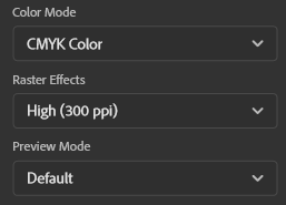
For example, in Adobe Illustrator, when you create a new file look for the color mode options and select CMYK. To ensure that your project is of the highest quality, also be sure to set your resolution to at least 300 ppi.
Pro tip: When designing for print, it’s best to use the Adobe family of products.
These programs are the design standard for the printing industry and will guarantee color compatibility between your design and your printing partners’ equipment.
Web-based design tools like Canva that are rooted in the RGB color space are great for digital design but are frequently the source of color issues for commercial print applications.
Paper
There is a wide variety of paper options that can be used for any project. Paper is generally categorized by weight and finish type.
Paper weight is usually organized into two categories:
- Cover Stock, sometimes referred to as card stock, is recognizable by its overall thickness and sturdy feel. This stock is best used for postcards, invitations, envelope inserts, and any piece that needs to convey quality.
- Text weight runs the spectrum between everyday copy paper and high-end magazine stocks. Overall, it will always be much thinner than a cover stock but oftentimes noticeably more sturdy than standard copy paper.
Beyond weight, paper can be further classified by finish or lack thereof:
- Coated stocks most frequently come in Gloss, Dull, Satin, Silk, or Matte varieties. This coating allows the ink to sit on top of the sheet rather than being absorbed by it. Colors are more vibrant, and the finished piece is more durable thanks to its protective coating making it the ideal choice for postcard mailings. The protective coating has many advantages both aesthetically and functionally, but it is not easily written on with a standard pen. Avoid this stock if your finished piece needs to be written on.
- Uncoated stocks are easily identified by their dull appearance and generally smooth texture. Because this stock lacks a protective coating, ink is absorbed by the sheet resulting in more muted colors that can be desirable for a more classical aesthetic. Without a coating to block the absorption of ink, this stock can be easily written on but is prone to scratching and damage. Avoid this stock for standalone mail pieces to prevent damage during the production and mail sorting process.
Admail has a free paper stock sample book to provide a physical aid in selecting the correct stock for your next print project. Request yours today!